Joppa Community Tennis Club.
Brand Identity, Stationery
Joppa Tennis is a small two-court Members Club providing socialisation, competition, and coaching. The brief was redesigning the current mark.
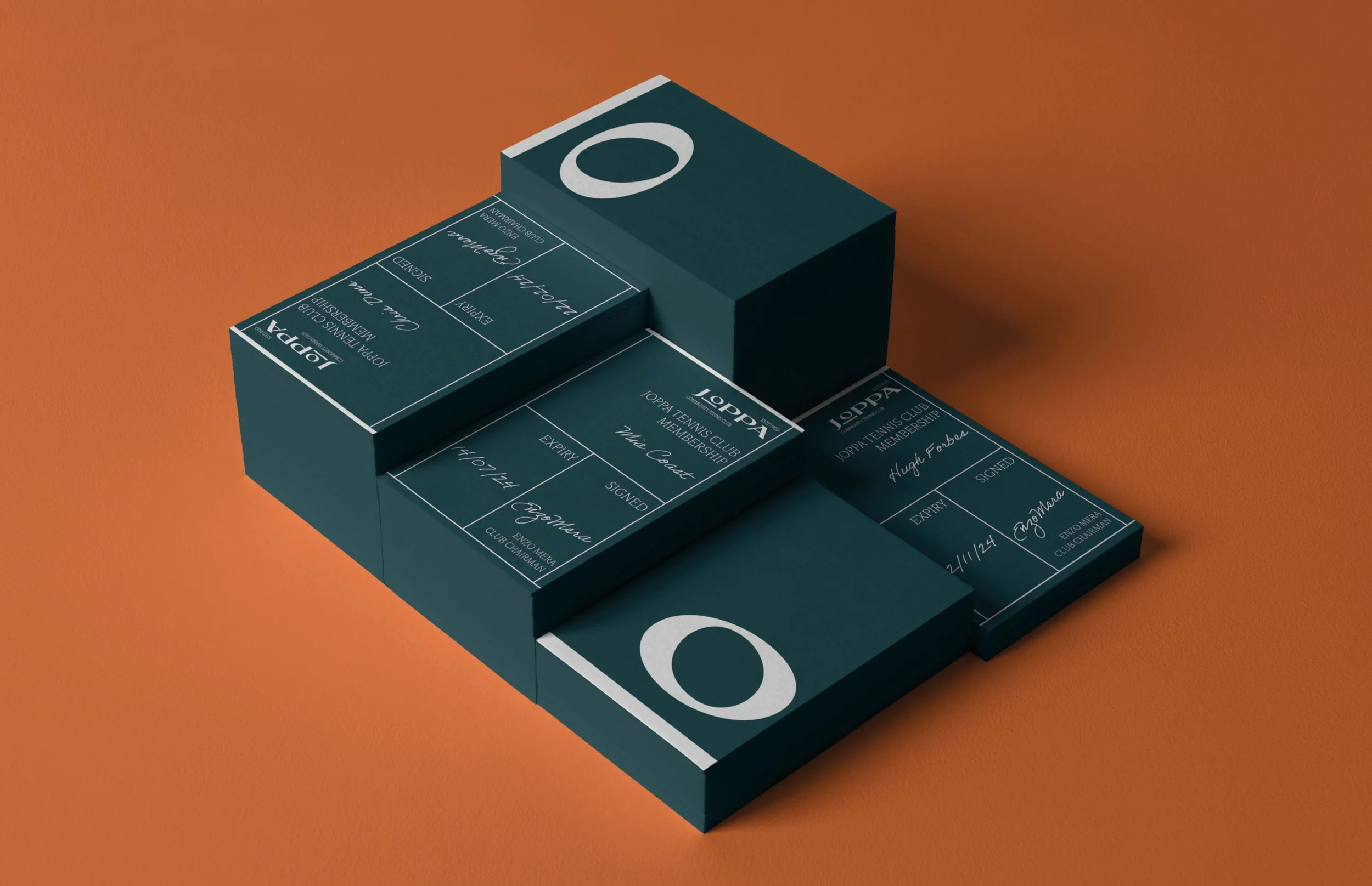
The logo created was designed to showcase the classic heritage and the modern age of the club. The ‘O’ was made to look like a tennis ball going over the ‘tennis net headband’, altered to be off-centred to reflect the effortless ‘human’ serve. The type is modified ‘Coconat’, to create a bold, sharp, and graceful sportsmanship style. Midnight Green is a classic, sleek colour and was used to contrast with the colour of the court.
The club’s membership cards are made to resemble your side of a tennis court- when placed against another players card you get a full court. Information is written allowing the same design of card to be printed.
The logo animates to show the ball going over the net.


