Good Movement.
Brand Identity, Stationery
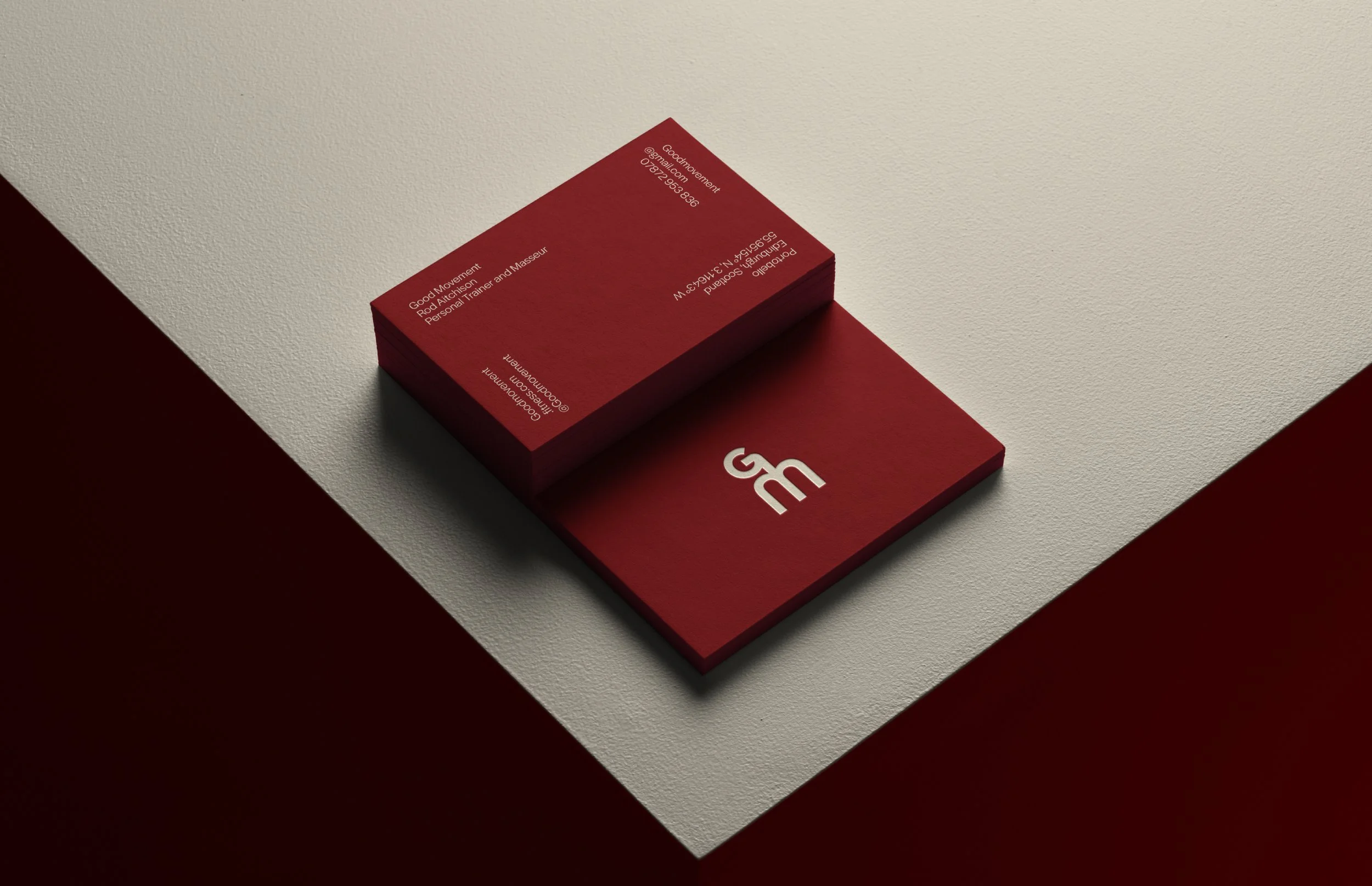
‘Good Movement’, is a fitness brand specialising in personal training and massage therapy. The logo is made to symbolise a person; designed around the initials of the words. With retro sports inspiration; fluid type was used expressing the flowing, healthy nature of the brand. Maroon and cream were chosen to represent the human body- blood and bone. Arms of the logo can be animated to illustrate physical poses.‘
The information on the business card rotates 90 degrees on every corner to include subtle movement. Heavy paper weight can be used to convey robust fitness.
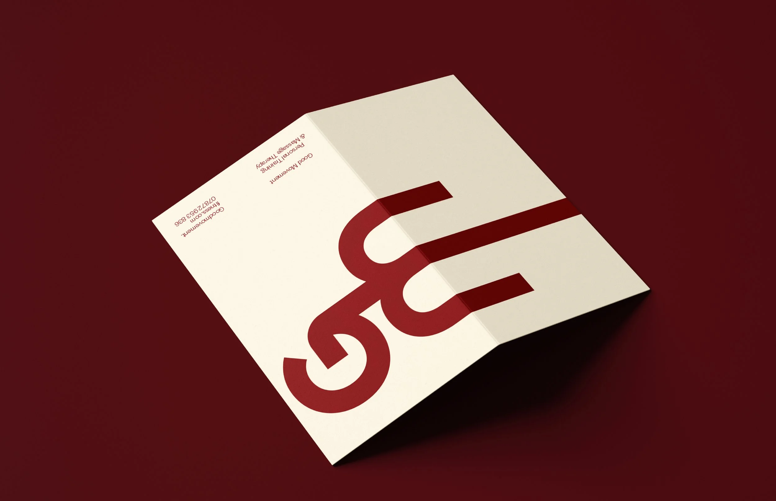
An enlarged logo was placed across the front of the brochure with the middle stem of the ‘M’ elongated over the fold so to express the idea of a downward dog stretch.


